Designing an online platform to simplify reservations at sports facilities

Research, Branding, UX Design, UI Design, Testing, Product design
Mockup playloc 1 copy.jpg

ABOUT

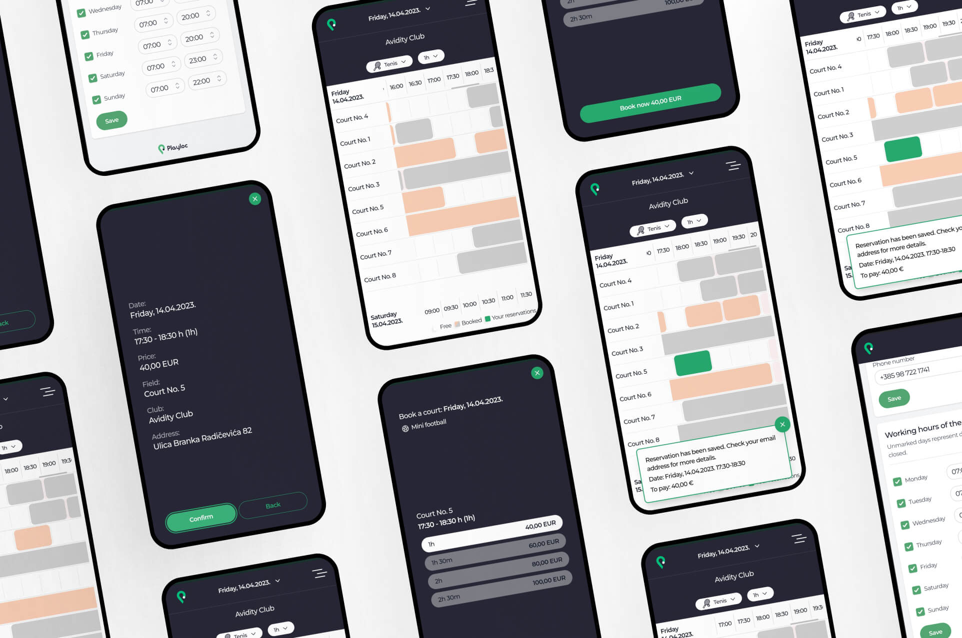
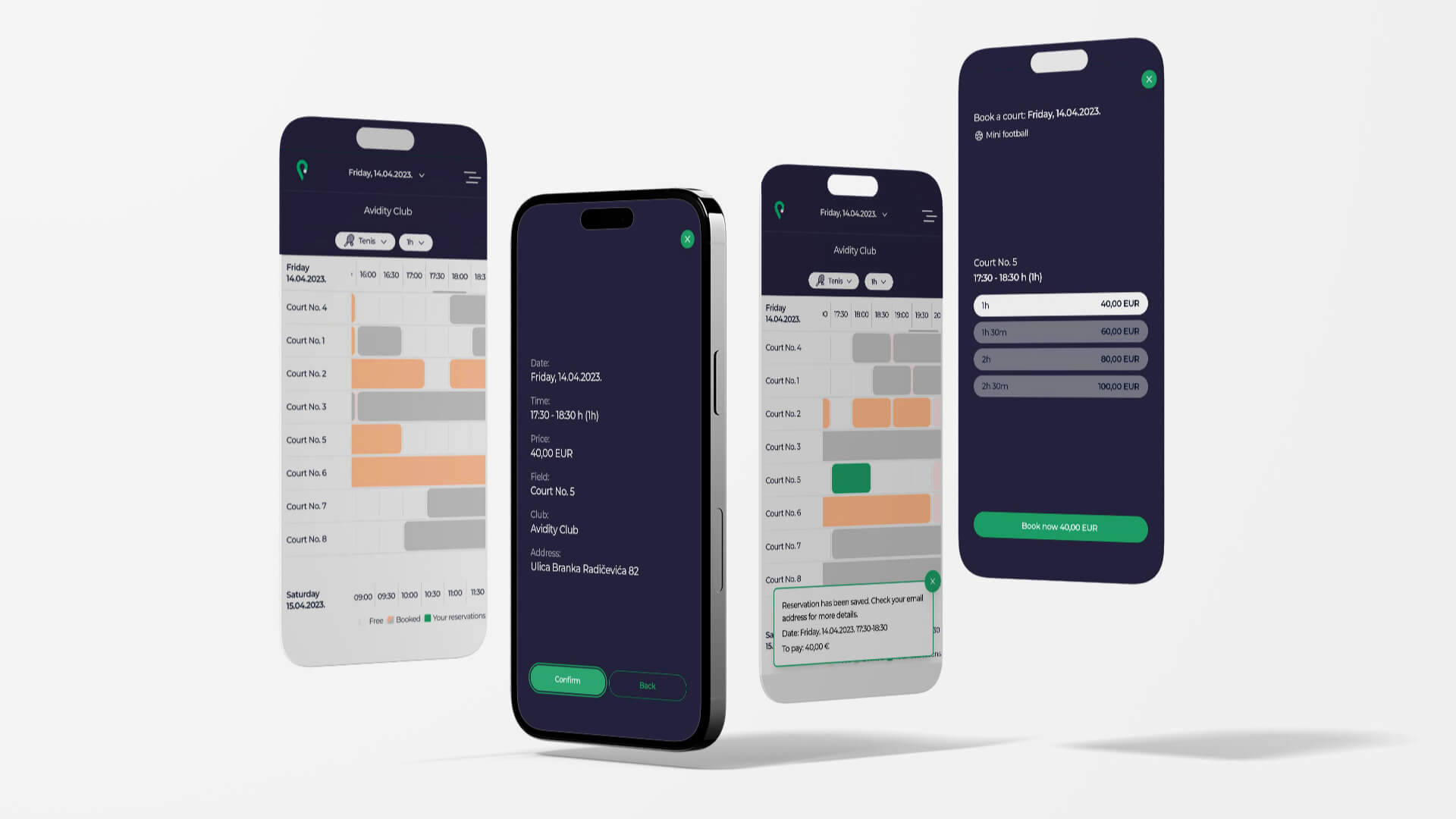
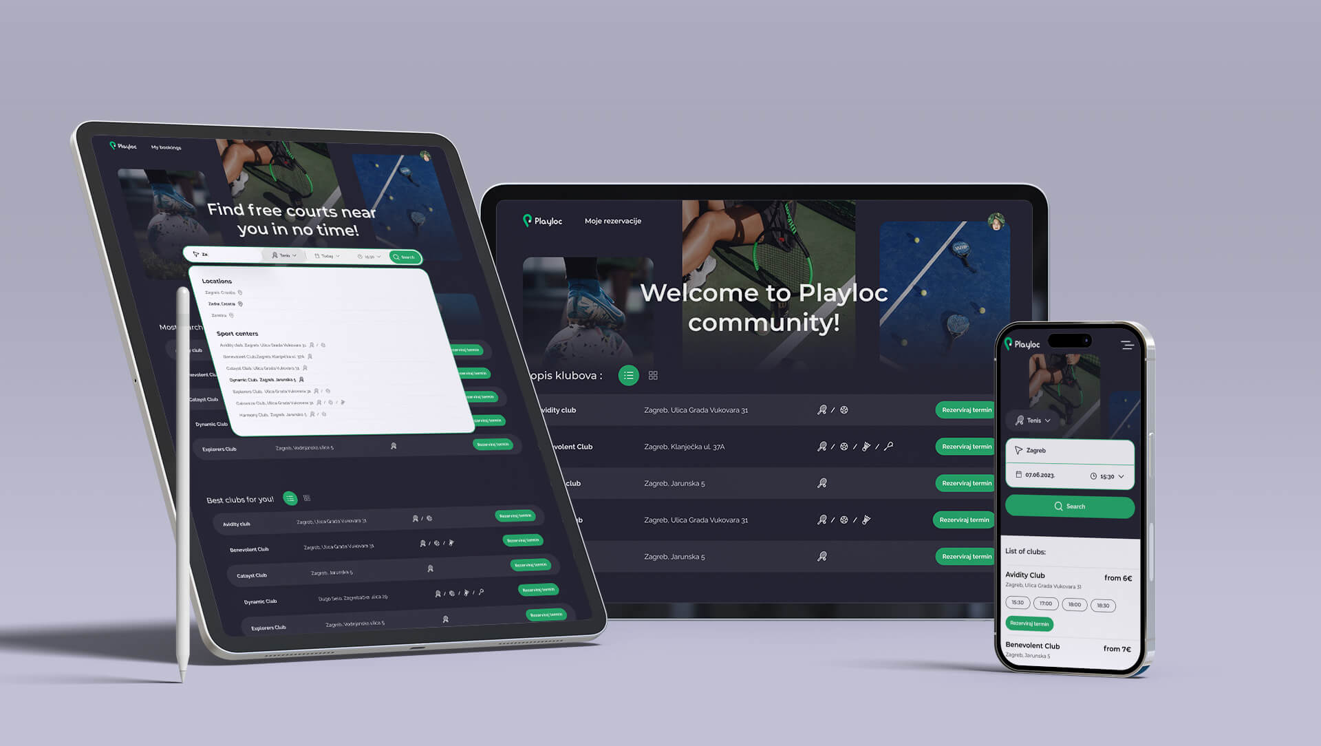
Playloc is the platform my team and I created to meet the growing demand for a reliable and efficient booking system for sports facilities. Our platform streamlines the booking process, making it easier and faster for users to find and reserve available courts. With Playloc, we aim to enhance the overall experience of sports enthusiasts and facility owners alike, by providing a user-friendly and high-quality service.
Mockup Playloc  1.jpg

Branding

Branding Playloc was an essential part of my team’s development process. We wanted to create a brand that accurately reflects our platform's value, mission, and brand name. I created a logo that consists of a ball in movement and a pin location shape symbolizing the action, sport, and location. Your place of action, Playloc.

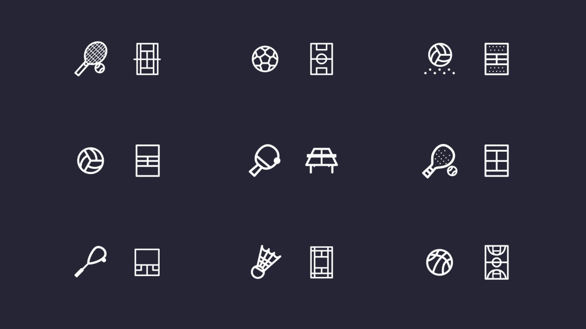
Added to the logo I designed a set of icons we can use through the platform, it consist of all the sport’s our platform is offering.

image 39.jpg
image 41.jpg
slika 1.jpg

Challenges

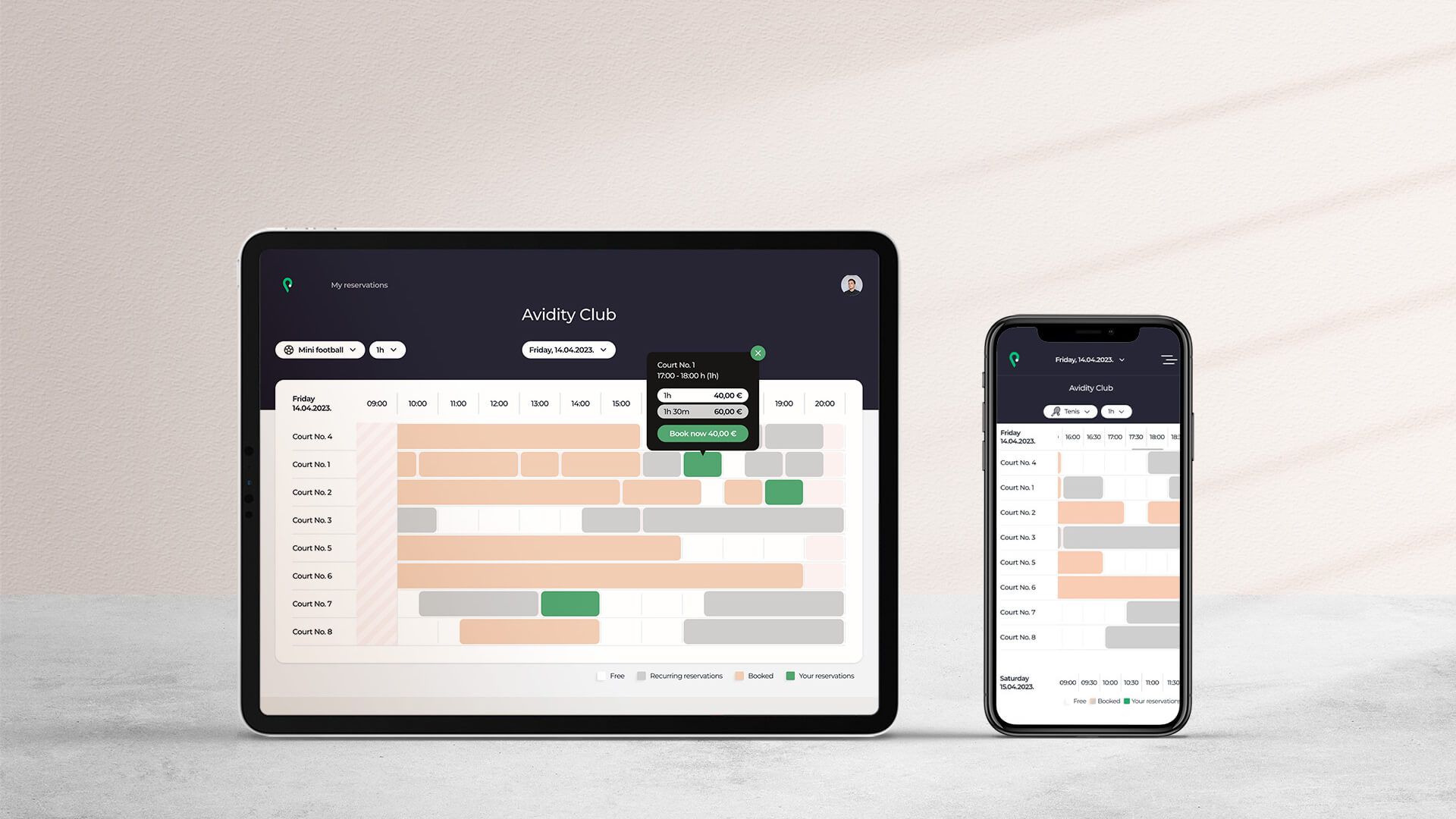
My team and I faced several challenges in testing our creativity and problem-solving skills. One of the main challenges we encountered was finding an effective way to display all available courts within a single screen without compromising the user experience. Another challenge was ensuring that users could easily access the platform, regardless of the device used. Finally, we integrated multiple payment gateways to provide users with a secure and convenient payment process, which proved to be a complex and time-consuming task.

phones (1).jpg
bijela 1.jpg

Solutions

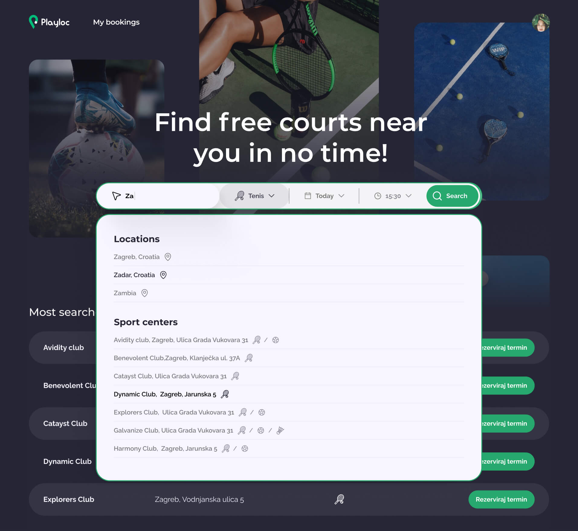
With mobile-first approach in the design, I prioritised user experience on mobile devices and progressively enhanced it for larger screens. Through extensive cross-device testing, my team and I ensured a consistent and smooth experience for users on various devices. We also created central page for users, where they can easily browse through the clubs, sports, and cities. This page helps users find the courts with ease, with just a few clicks.

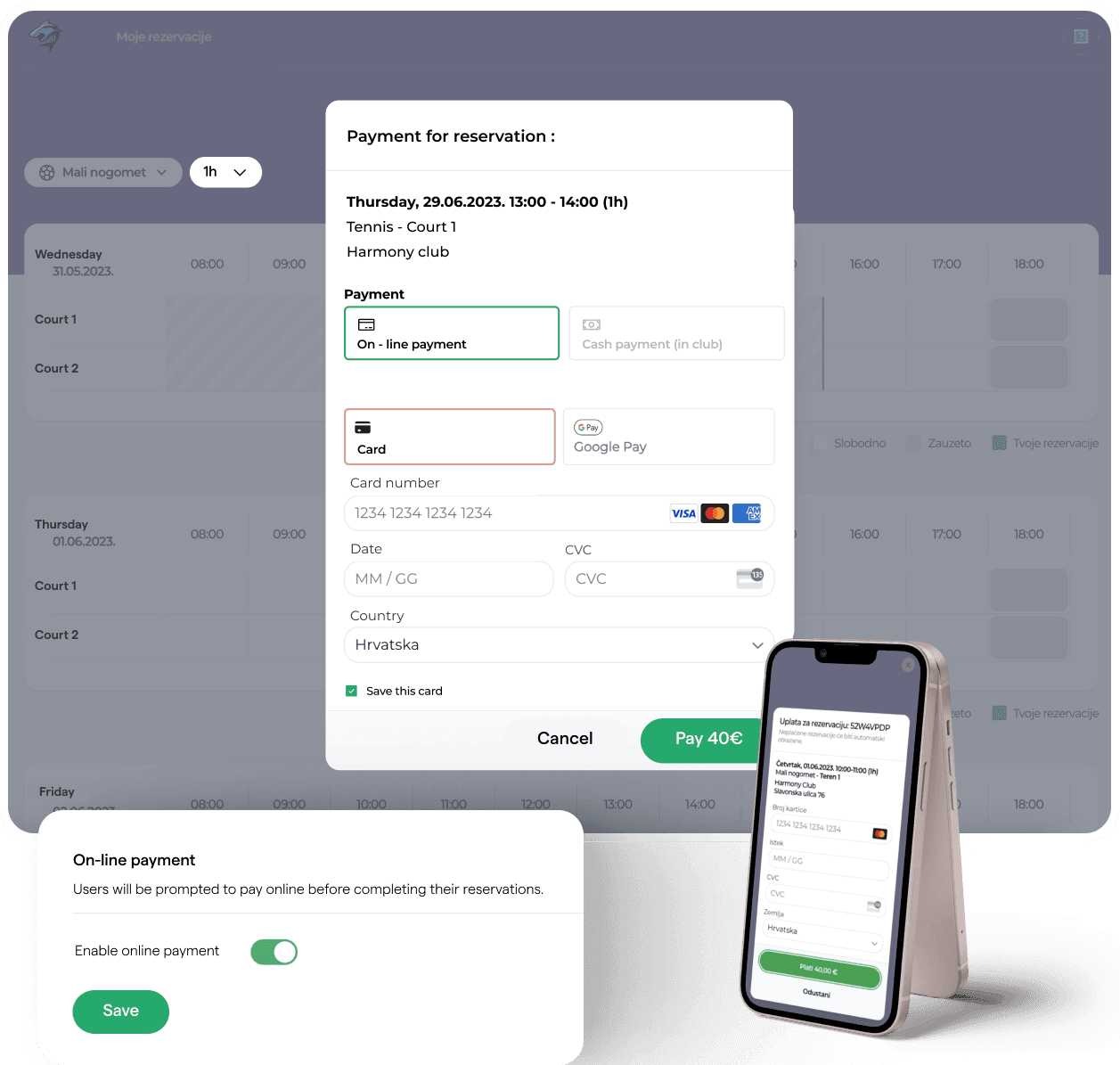
Furthermore, we integrated payment gateways to provide users with a secure and convenient payment process. We selected Stripe for its ease of integration and customization in design. By optimizing the checkout process for a frictionless experience, users can efficiently complete their transactions with ease.

Central place.jpg
On line payment (1).png

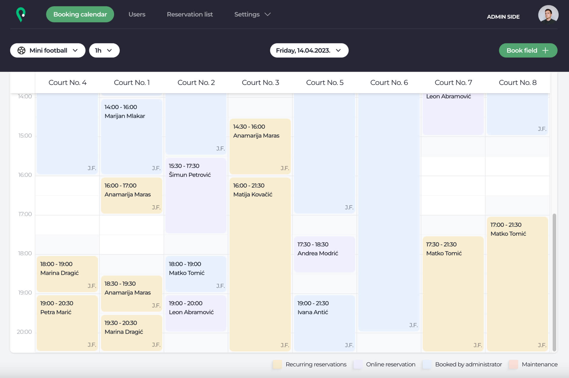
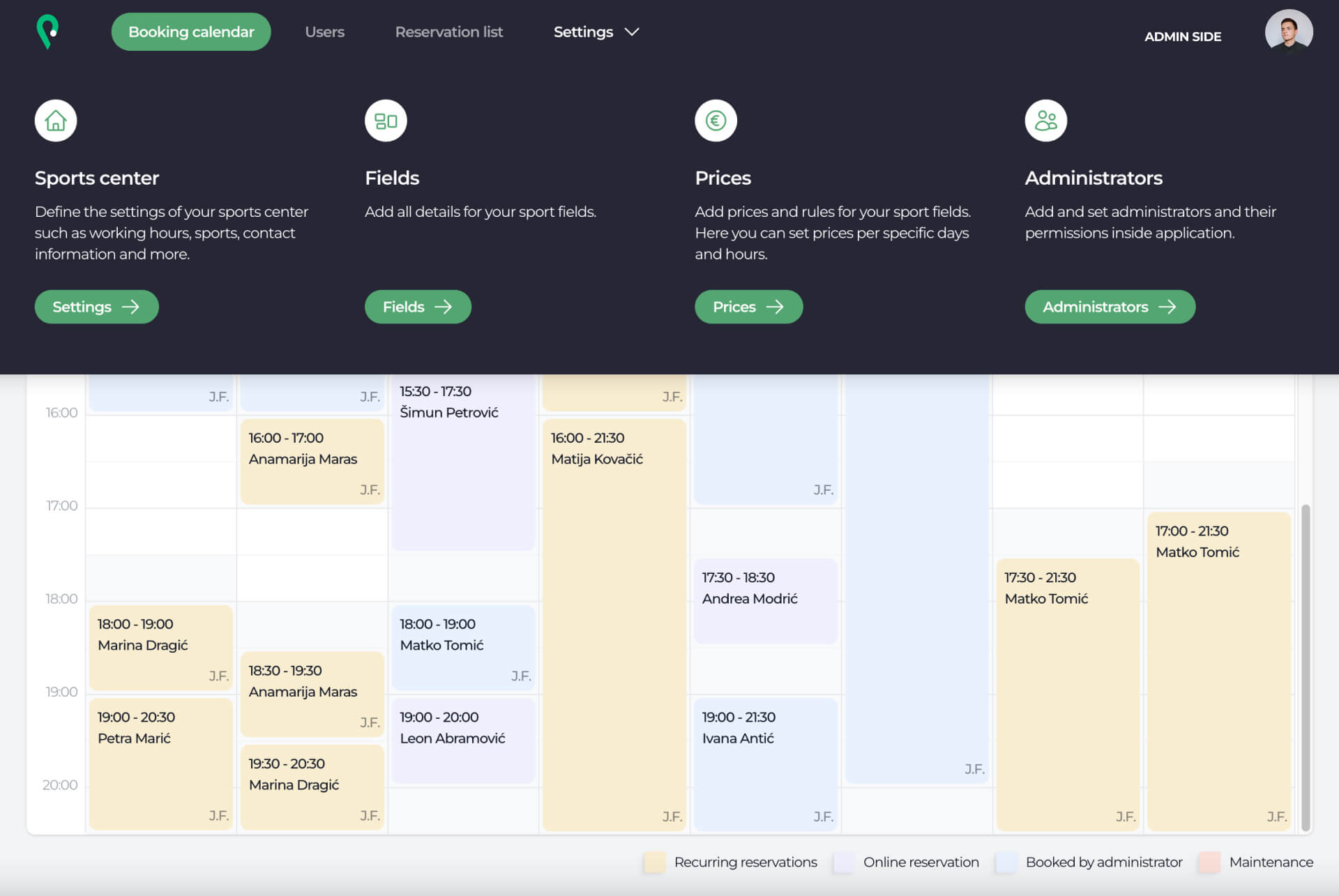
Of course, admin side of the app is just as important as user side. Through the admin panel, facility owners can view all their bookings, manage court availability, set pricing, and communicate with customers through various options.

Admin side 1.jpg
Group 43907.jpg

FINAL WORD

This project couldn't have come at a better time. From its inception to completion, I had the opportunity to be involved in every stage of the product design process. Witnessing the evolution of PlayLoc has been an eye-opening experience, providing me with invaluable insights into the complete lifecycle of a product.

Working alongside my team, I feel a sense of pride in what we have accomplished. PlayLoc represents the culmination of our dedication, creativity, and collaborative efforts. I am optimistic about its future, as we remain committed to continuous improvement, striving to make it even better with every iteration.

I am very excited to embrace new opportunities in product design, knowing that each venture will contribute to my growth and expertise.

See next project

KKG Biloboard 1 copy.jpg

Creating a visual identity for a volunteer club

Logo design, Brand book

Let's starta project

Contact me